1

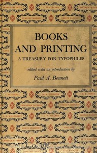
Books and Printing; a Treasury for Typophiles — A Closer Reading
(0 User reviews)
81
Project Gutenberg
2020
Not confirmed
Book industries and trade; Printing -- Specimens; Printing; Book design
Readers of public-domain and historical texts
Project Gutenberg digital edition
en
Edition facts
Words
145,369
Reading time
633 min
Text sections
101
This digital edition of Books and Printing; a Treasury for Typophiles — A Closer Reading is described by source-level measurements including 145,369 words, 10 hr 33 min estimated reading time, and 101 detected text sections.
The text analysis averages about 22.3 words per sentence, while the detected sections provide another way to judge how the source is divided.
Project Gutenberg metadata also associates the work with “Book industries and trade,” connecting these edition facts with the source record’s subject description.
Source:
Project Gutenberg record #63730
An anthology of essays on book design, typography, and printing, edited by Paul A. Bennett, drawing from Typophile chap books and other sources. The opening excerpts reveal a focus on the material craft of bookmaking, with contributors like T.M. Cleland and W.A. Dwiggins, and a notable account of Nonesuch Press's editorial and production practices.
Editorial Edition Score
4.9/5
★★★★★
★★★★★
Calculated from edition completeness, EPUB availability, text structure and catalogue metadata. Not a user rating.
How this score is calculated
- Description quality20 pts
- Title & short description10 pts
- Source metadata20 pts
- Text length15 pts
- Chapters / structure15 pts
- EPUB file integrity20 pts
Total of 100 points, scaled to a 2.5-5.0 range. Editions with an empty description or a missing EPUB file are not scored.
Edition quality
Read the Text
There was no preconceived attitude to consider in evaluating the essays included: no restriction by country of origin; no fixation about the traditional or modern in typographic approach; no desire to slant, or plant, ideas; no intent other than to select much of the best writing in English by authors of substance. That the gathering may provide riches to be added to "the savings account of your memory" is my hope.
In a quite real sense, the experience has been something like spending many long weekends with friends in good, solid talk--some of it controversial, much of it illuminating and informing. The re-reading has not only opened "doors and windows for a welcome flood" of ideas, it has suggested new trails and made for valuable comparisons of favorites first met with years ago.
It has been difficult to resist the temptation to include more essays of historic and technical appeal to typographers and printers. Many of the present generation, I presume, may not know De Vinne's authoritative account of the development of the American Point System, which occurred in the late eighties and is detailed at length in his _Plain Printing Types_; or the invaluable Meynell and Morison essay on "Printer's Flowers and Arabesques," with its fascinating reproductions, from _The Fleuron_. I have omitted these two with reluctance, and have used the space they would occupy for a half-dozen shorter essays not less worthy in themselves, but on different topics.
Since space was limited, I needed to be. I would have welcomed the opportunity to include additional essays by D. B. Updike, whose incomparable _Printing Types: Their History, Forms and Use_; _In the Day's Work_, and _Some Aspects of Printing: Old and New_, and other writings on typography should not be missed; by W. A. Dwiggins, the distinguished American letter artist and designer, who writes as well as he draws; and by Holbrook Jackson, the great English critic, literary historian and essayist, whose _Anatomy of Bibliomania_, _Fear of Books_ and _Printing of Books_ are required reading.
There are other favorites omitted too, for unlike Jackson's remark about the house of books, "There are many mansions and room for all trades, whims, and even fads"--this book could comfortably hold no more.
It has not seemed desirable, as it would be possible, to eliminate a degree of duplication in part among some of the essays. That would have required an amount of editorial surgery and revision unfair to the authors concerned. More importantly, it would have assumed that every reader would read every essay--hardly an attainable ideal.
Nor has any documentation been attempted to reconcile opposing viewpoints--that of A. W. Pollard and Holbrook Jackson, for instance, in respect to William Morris as printer and typographer. Happy will that reader be who finds this and other instances sufficiently provocative to embark upon further research of his own.
And while it is easier to come upon material in a collection such as this than to track down each item individually, much of the fun of the search is missing, along with the memorable thrills of discoveries in scattered places. There's much gold yet to be found by even moderate digging.
The greatest area for argument is that within the opposing views of the modern and traditional approach to book design. It is unrealistic to oppose the concept that contemporary typography should reflect some of the differences that mark our time from other epochs. Defining distinctions and relating them precisely to the arts of the book is something else again.
In his eloquent _Harsh Words_, T. M. Cleland decries the restless craving for something new. "This poison is aggravated in printing and typography," he insists, "by the fact that of all the arts it is, by its very nature and purpose, the most conventional. If it is an art at all, it is an art to serve another art. It is good only so far as it serves well and not on any account good for any other reason.
"It is not the business of type and printing to show off, and when, as it so frequently does, it engages in exhibitionistic antics of its own, it is just a bad servant.... Typography, I repeat, is a servant--the servant of thought and language to which it gives visible existence. When there are new ways of thinking and a new language, it will be time enough for a new typography."
The anthology opens with a detailed account of the Nonesuch Press, where Francis Meynell recounts the firm's move from a cellar to Great James Street and the decision to incorporate. He describes the collaborative process with illustrators like E. McKnight Kauffer and the peculiar discipline of banning "red-herring words" such as "functional" during office hours. The excerpt also reveals George Moore's obsessive proofreading, where each revision transformed the text, and the printer's willingness to absorb losses on text setting while recouping on title-pages. This concrete, anecdotal style sets the tone for a collection that values the practical and the peculiar in printing history.
A Treasury of Typographic Voices
The table of contents, though not fully excerpted, indicates a range of contributors including T.M. Cleland, W.A. Dwiggins, and Lawrence C. Wroth. The editor's acknowledgments credit the Typophiles of New York and individual authors from their Chap Books series. This suggests the volume is a curated selection, not a unified treatise. Readers should expect varied perspectives on type design, bookbinding, and the economics of fine printing, rather than a single narrative. The inclusion of pieces like Dwiggins' "Investigation Into the Physical Properties of Books" hints at a blend of technical analysis and personal reflection.
The Nonesuch Press: A Case Study in Craft
The most substantial excerpt details the Nonesuch Press's operations under Francis Meynell. He notes the firm's survival during the Great Depression by maintaining honest pricing and quality materials, avoiding the inflated prices of competitors. The anecdote about George Moore's revisions—where proofs were read aloud daily, each time a new text—illustrates the tension between artistic perfection and commercial reality. Meynell's own admission of setting 37 different title-page variants for one book underscores the obsessive attention to detail that defines fine press work. This section offers a rare insider view of the compromises and passions behind limited editions.
Physical Properties and Practical Details
The excerpts include transcriber's notes about typographic features like the long s (ſ) and ligatures ([ct], [ffi]), indicating the original text's historical typography. The note that certain font families (Times New Roman, Gill Sans, Garamond) were used in the HTML version, but not all devices may render them, points to the challenges of digital reproduction. Readers of this edition should be aware that the visual experience of the original—with its varied typefaces and layouts—is partially lost. The editor's decision to preserve hyphenation variants and ancient punctuation suggests a commitment to textual fidelity, even when it complicates modern reading.
Collaboration Across Continents
Meynell acknowledges the importance of American sales and the 1927 alliance with Random House. He describes the collaboration as "satisfactory from a technical or a personal point of view," hinting at the transatlantic networks that sustained fine printing. The excerpt also mentions the role of collectors and the impact of the Depression on the secondary market, where hoarded copies flooded in and prices deflated. This economic dimension—how luxury book production navigated boom and bust—adds a layer of realism to the romantic image of the private press. Readers interested in the business of bookmaking will find these details revealing.
This anthology rewards readers who approach it as a series of discrete, expert testimonies rather than a continuous argument. The excerpts suggest that the most vivid insights come from the contributors' firsthand experiences—Meynell's office anecdotes, Dwiggins' physical investigations, and the transcriber's typographic notes. To get the most from this collection, read each essay on its own terms, attending to the specific material conditions and personalities that shaped the printed page. The book is less a survey than a cabinet of curiosities, best explored in short, focused sessions.
Reading Bennett’s treasury, I kept thinking how the craft of pages mirrors the quiet patience in Warner’s essays—each sentence set like a metal type, unhurried. His world feels hand-inked, not mass-produced. That same tenderness for the made object lingers in The Complete Essays of Charles Dudley Warner — Inside the Classic, as if both books shared a pressman’s steady hand.
There are no reviews for this eBook.
There are no comments for this eBook.
Reader reflection
How will you remember this book?
Save your reaction, strongest insight, and memorable passage.
Your progress
0
/
10
2
How did the book work for you overall?
3
How likely are you to recommend this book?
4
How easy was the book to follow?
5
Could you apply anything you learned?
6
Which element worked best for you?
7
How much did the book move you?
8
Did you relate to its people, ideas, or situations?
9
What changed or sharpened your thinking?
10


![Cover of Pebbles on the shore [by] Alpha of the plough — Reading Companion](https://eommi.com/storage/media/covers/pg10675.jpg)